Baselight makes it easy to turn your data into powerful, visual insights using its integrated chart builder. Whether you’re analyzing any structured dataset, Baselight’s visualization tools allow you to quickly create charts, spot patterns, and share results without leaving the platform.
Getting started with charts
Charts are built directly from query results in Studio. Run a query, click the Chart tab, and a configuration panel opens on the right. Everything – chart type, data mapping, and styling – lives in that panel. Two buttons are always available at the top of the results area: Add to Dashboard and Download Chart.
Step 1: Run a Query
Start by using the built-in SQL engine to query one or more datasets from the Baselight catalog. Once your query runs successfully and returns a table, you’ll see a “Chart” button above the output.
Step 2: Choose a chart type
The panel shows eight chart types to pick from:
- Bar – compare values across categories. Example: revenue by region, player count by team.
- Line – show trends over time. Example: stock price over months, user growth week by week.
- Area – like a line chart but with the area below filled in, good for showing volume or cumulative totals.
- Candlestick – shows open, high, low, and close values. Built for financial and time-series data.
- Scatter – plot two variables against each other to find correlations. Example: age vs. income, price vs. sales volume.
- Bubble -like scatter but a third variable controls the size of each point.
- Pie – show proportions of a whole. Example: market share by company, budget by department.
- Combo – combine multiple chart types in one visualization. Example: bars for revenue with a line for the trend

Click the type you want and the chart preview updates immediately.
Step 3: Set the category
Under Select Data, choose a column from the Category dropdown. This becomes the x-axis or grouping dimension. Baselight suggests the most likely columns at the top – you can pick any column from the list.
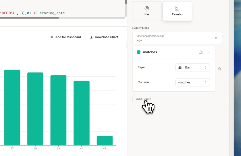
Step 4: Add a series
Click Add Series to map a data column to the chart.
Step 5: Switch to Advanced for full styling control
Toggle from Basic to Advanced at the top of the panel for granular options.
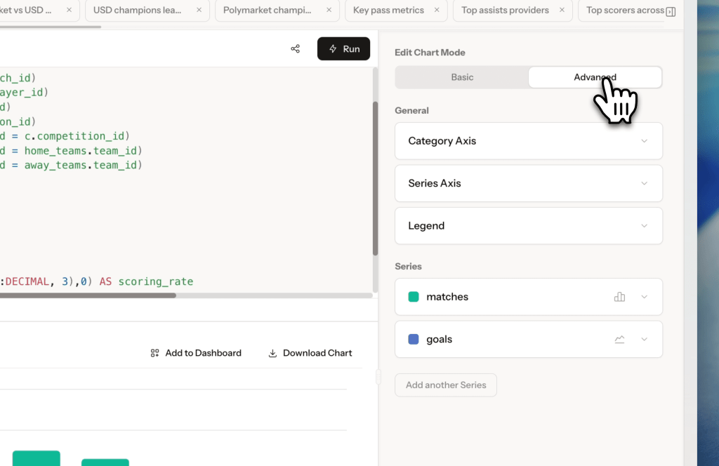
Category Axis
In this section, you can configure how the X axis will be presented. Attributes you can control:
- Show values toggle – will hide or show the values
- Title
- Column – what data will be used to display the X axis,
- Orientation – whether the chart will be horizontally or vertically displayed,
- Interval – a setting to configure if all labels must always be presented or it can be automatically adjusted to the size of the chart,
- Color – hex color picker
- Rotation – 0, 45, 90, -45, or -90 degrees
- Formatter controls how numbers display: None, Integer, Decimal, One Decimal, Two Decimals, Three Decimals, Abbreviated (1B/1M/1k), Bytes, Duration (from seconds), or Hours (from seconds)
Legend
Applies to the whole chart:
- Show or hide the legend
- Set orientation (Horizontal), position (Top Right), and alignment
- Adjust padding and margin with sliders
Per-series styling
Expand any series card to see the detailed configuration possibilities. For example, line chart settings will include:
- Display Line toggle
- Curve – Linear, Smooth, or Step
- Width – Thin, Medium, or Thick
- Color – hex color picker
- Style – Solid, Dotted, or Dashed

Point settings:
- Display Points toggle
- Symbol – Circle, Square, Diamond, Triangle, or Pin
- Size slider
- Color – hex color picker
Values Presentation (show data labels on the chart):
- Display Values toggle
- Alignment – Left, Center, or Right
- Position – Top, Bottom, Inside, Right, or Left
- Color – hex color picker
- Rotation – 0, 45, 90, -45, or -90 degrees
- Distance – slider
- Formatter – controls how numbers display: None, Integer, Decimal, One Decimal, Two Decimals, Three Decimals, Abbreviated (1B/1M/1k), Bytes, Duration (from seconds), or Hours (from seconds)
Alternate Axis:
Show On Separate Axis plots this series on a second y-axis, useful for Combo charts where two series have very different scales
To remove a series, click Remove this series at the bottom of its card.
Step 6: Export or add to dashboard
When the chart looks right you can:
- Download Chart – saves the chart as an image file
- Add to Dashboard – sends the chart directly to one of your dashboards
